





The Blind Spot of the Home
Walk into almost any Pakistani home, and you will find one surface working harder than it should and styled less than it deserves: the console table. It catches the keys dropped on the way in, the mail nobody has opened, the sunglasses tossed aside after a long drive through Karachi traffic. Somewhere between the front door and the living room, this narrow stretch of wood or stone becomes a holding pen rather than a statement.
That is the real blind spot. A console table is not filler furniture wedged against a wall to fill empty square footage. It is a high-impact architectural canvas, a threshold moment that bridges the entryway and the living zones beyond it. Guests read a home in seconds, and the console is often the first surface their eyes land on. Left cluttered, it says afterthought. Curated with intention, it says this home has been considered, room by room, right down to the smallest surface.
Part of the neglect comes from proportion. A console table is long and narrow, resisting the instinct to place a single centrepiece and call it finished. It demands a different design language, one built on layering, height variation, and negative space rather than the centred symmetry of a dining table. Understood as something read horizontally, almost like a sentence, styling a console stops feeling like guesswork and starts feeling like composition.
Anchoring with Structure: Books and Sculptural Bookends
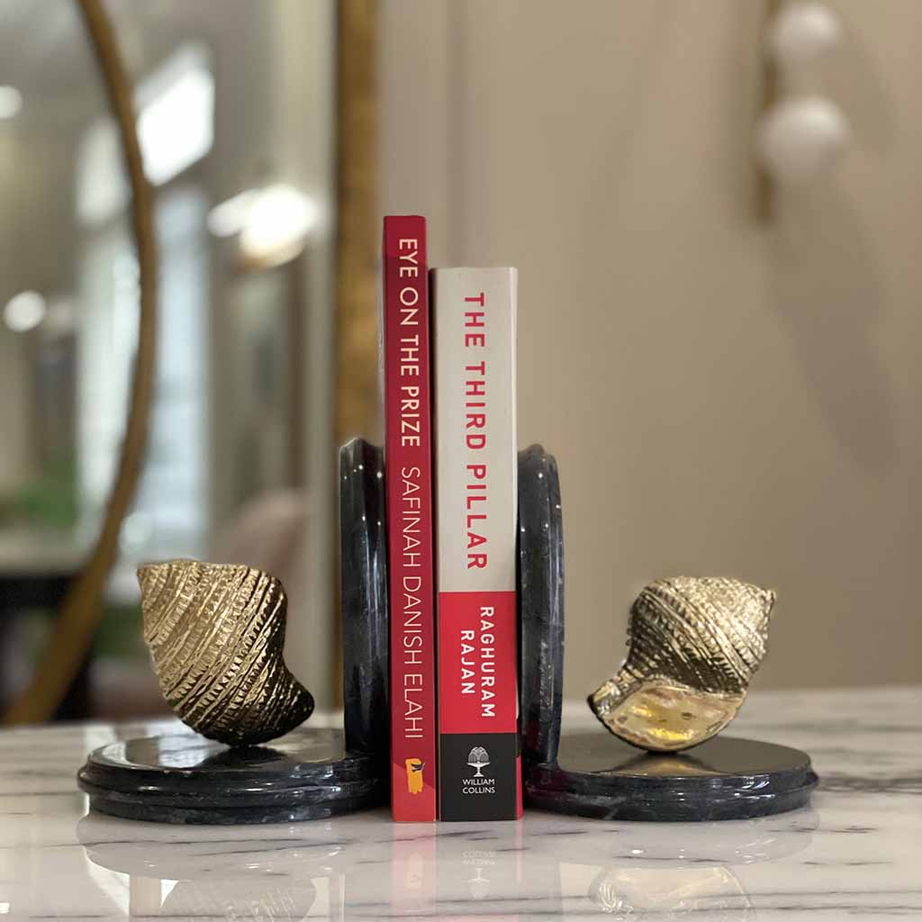
Every strong console vignette begins with structure, and structure begins with books. A horizontal stack of two or three coffee table books, chosen for their spine colour and physical heft, creates an immediate sense of grounding. But books left to slouch sideways look accidental. This is where sculptural bookends earn their place.
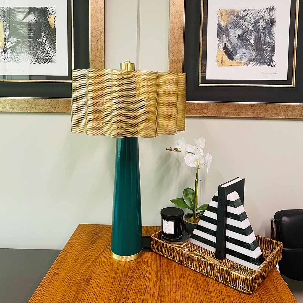
Opt for modern bookends for shelves with clean, architectural geometry, cubes, angled planes, or minimalist arcs, to introduce contemporary structure without competing with the console’s own lines. For a softer, more organic counterpoint, raw or polished marble bookends Pakistan artisans have long worked with bring visible veining, cool tactile weight, and an old-world elegance that photographs beautifully against warm wood tones.
The principle to remember: framing your book stack with a pair of considered luxury bookends instantly elevates a flat surface into something closer to a private gallery ledge. It is the difference between “I had extra books” and “I designed this corner.”
Material pairing matters as much as form. A pale marble bookend against a dark walnut console reads as deliberate contrast; a brushed brass pair against a light oak surface introduces warmth without visual noise. Resist the temptation to buy books for their covers alone, spine colour, texture, and even the worn edges of a well-loved hardback all contribute to the tactile richness that makes a console feel lived-in rather than staged.
The Perfect Vignette Formula
Once structure is in place, layer with intention using this four-part formula:
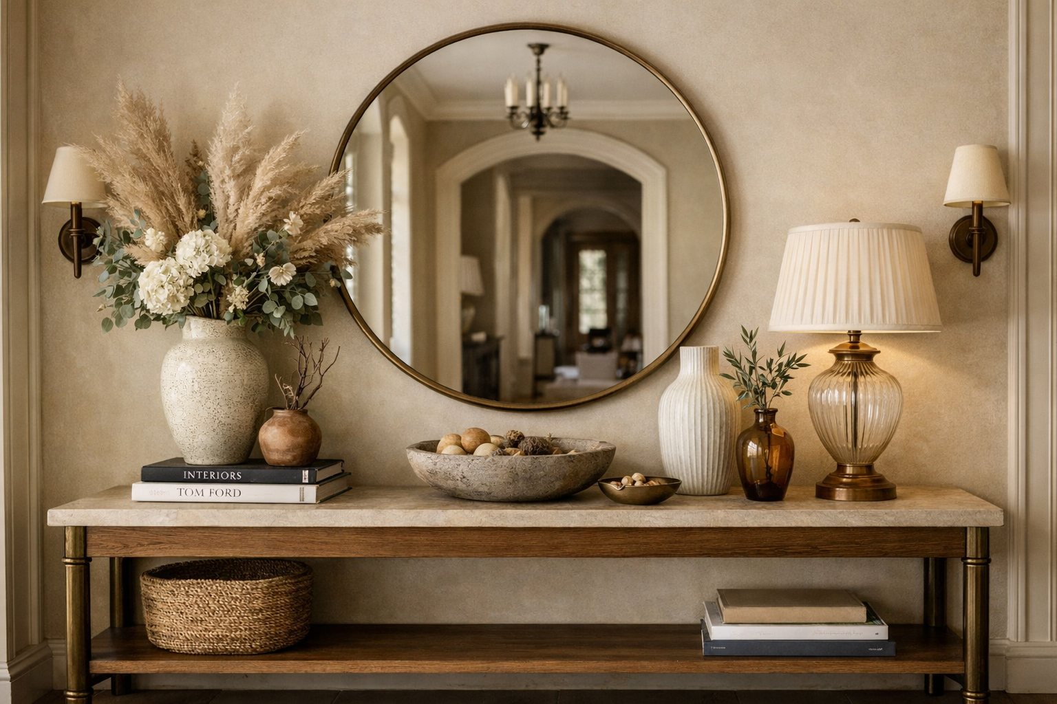
- The Backdrop: Anchor the wall above with a large mirror or an oversized framed art piece. This pulls the eye upward, exaggerates ceiling height, and doubles the sense of light in entryways that often lack windows.
- The Light Source: Place a tall table lamp toward one end of the console. This establishes vertical height on one side, casts warm ambient light in the evenings, and prevents the arrangement from reading as flat.
- The Organizer: Introduce a decorative tray to corral keys, mail, or a cluster of unlit candles. This single object keeps daily clutter contained within a defined, elegant boundary rather than scattered across the surface.
- The Layered Accent: Position your bookends and book stack opposite the lamp. This creates counterweight, visual balance achieved not through symmetry, but through objects of similar mass distributed across the surface.
Together, these four elements create asymmetrical balance: height on one side, grounded structure on the other, breathing room in between.
Entryway Consoles vs. Living Room Consoles: Two Distinct Briefs
Not every console table is solving the same design problem, and treating them identically is where many homeowners go wrong.
Entryway Consoles should prioritise:
- First impressions, this is the handshake moment of your home
- A functional drop-zone for keys, post, and daily essentials
- High visual clarity, since guests only glance at this surface for seconds
Living Room Consoles should prioritise:
- Ambient warmth through layered lighting and softer materials
- Storytelling, travel finds, family photographs, personal collections
- Visual dialogue with surrounding seating, rugs, and existing decor
For those searching to buy bookends online Pakistan or looking to buy decorative bookends online, the smartest approach is choosing versatile pairs, pieces refined enough for a formal entryway yet warm enough to sit comfortably beside a favourite armchair in the living room. A single well-chosen pair, moved seasonally between spaces, often serves a home better than two mismatched sets purchased in haste.
Reading from Across the Room: Long-Range Impact
The final, most overlooked test is distance. Step back to the far end of the room, or better, into the adjoining space, and look at your console with fresh eyes.
- Does the silhouette read clearly, or does it dissolve into visual noise?
- Is there enough negative space, genuine, empty breathing room, around each object, or has the surface been overcrowded?
- Do the tallest and shortest elements create contrast sharp enough to register at a glance?
A console styled only for close inspection often fails this long-range test. The goal is architectural weight and visual balance that hold up whether viewed from three feet or thirty. This is also where restraint pays off: a console with one confident vignette photographs and lives far better than one crowded with five competing ones. Edit ruthlessly, then edit again.
Get this right, and your console table stops being furniture near the door, it becomes the quiet signature of the entire home, the small architectural moment that tells a guest, before a single word is spoken, exactly how much care has gone into every room beyond it.
Find the marble bookends, lamps, and serveware that turn a bare console into a curated moment. Shop Creo Living’s collection and let every surface in your home feel considered.
FAQs
1. What is the ideal height for a console table?
A: Most consoles sit between 32 and 36 inches tall, roughly matching standard countertop height. This range keeps table lamps and mirrors in comfortable visual proportion above it.
2. How large should a mirror be above a console table?
A: Choose a mirror that spans two-thirds to three-quarters of the console’s width. Anything narrower looks disconnected; anything wider overwhelms the surface below.
3. Should bookends match or contrast with the console’s material?
A: Contrast generally reads as more curated. A cool marble bookend against warm wood, or a matte metal pair against a glossy console, creates the tension that makes a vignette memorable.
4. How many objects is too many for a console table?
A: As a general rule, limit a standard-length console to four or five grouped elements: a lamp, tray, books with bookends, and one accent piece. Beyond that, negative space disappears, and the arrangement starts to look cluttered.