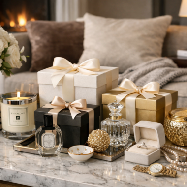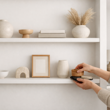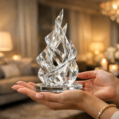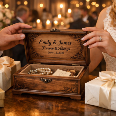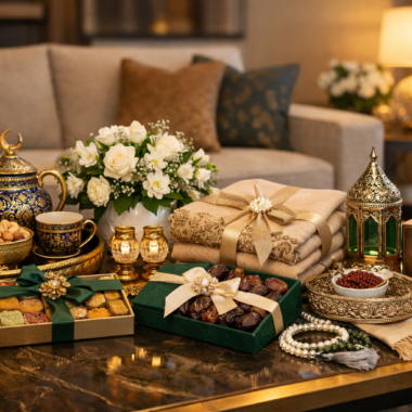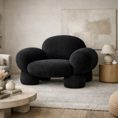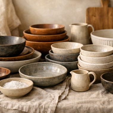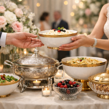
Most people begin decorating with a colour palette, a shade of sage, a warm terracotta, a moody charcoal, then choose cushions and objects mainly to match it. It is a familiar sequence, and also why so many rooms feel flat despite being carefully coordinated. Colour is the loudest decision in a space, but rarely the one that makes it feel considered. That distinction belongs to texture, the quieter layer of interior design that determines how polished, grounded, or genuinely rich a room feels the moment you walk into it.
Why Texture Deserves to Come Before Colour
Colour gets attention because it is immediate, the eye registers hue before surface, so colour becomes the default vocabulary for a room and the first decision most people make. Texture works more slowly, through light, shadow, and the instinct to touch, which is why it carries more weight over time than a first glance suggests.
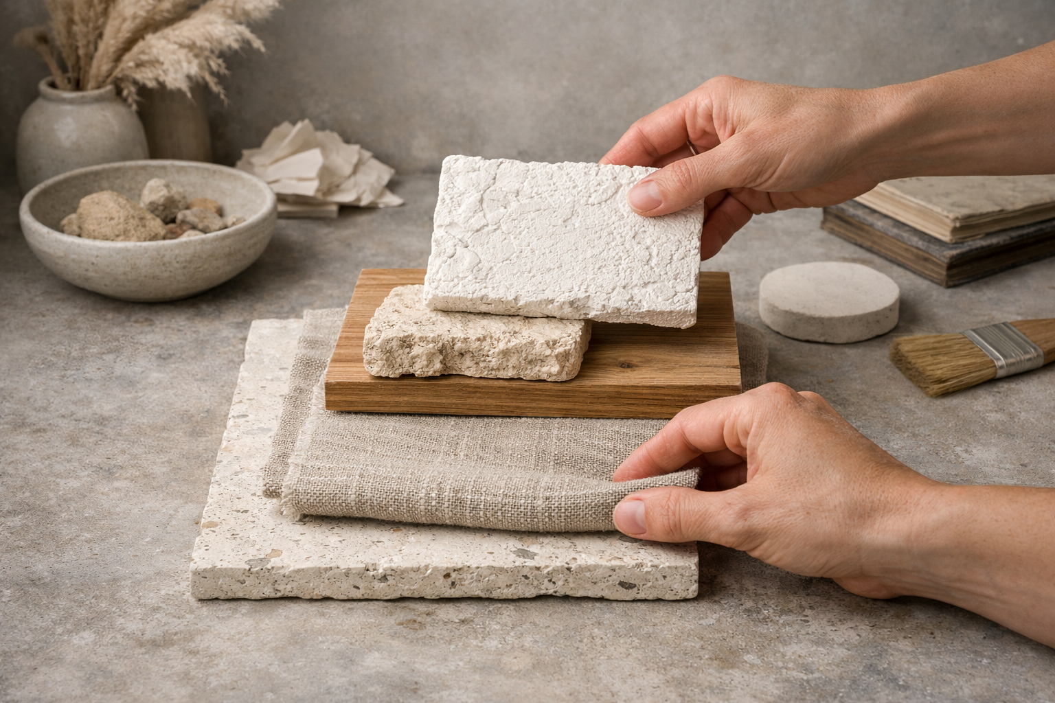
Two objects in nearly the same shade of white, a smooth porcelain vase and a raw plaster bowl, can feel entirely different, one cool and precise, the other soft and handmade. That gap has nothing to do with hue and everything to do with surface. This is the case for texture-first decorating: it introduces depth without adding more colour, which matters most in neutral interiors, where surface variation becomes the main source of interest. Colour trends move quickly and can date a room within a few seasons; material relationships shift more slowly.
The Tactile Hierarchy: When Materials Start Talking to Each Other
A handful of materials do most of the work in premium interiors, and how they behave next to one another matters more than how each looks alone.
Marble is cool and visually still, its veining moving quietly across a surface. Polished or honed, it carries a sense of permanence that grounds a room without competing for attention. Brass is almost the opposite, warm, its reflectivity producing a soft glow rather than a hard shine, sitting naturally beside stone, timber, ceramic, and glass. Ceramic, especially handmade, brings irregularity into an ordered composition; its matte, rarely symmetrical surface softens a polished console or lacquered tray that might otherwise feel severe. Lacquer sits at the opposite end: smooth, controlled, catching light in sharp lines, clinical alone, striking beside something rougher or organic.
The interest happens in the combinations. Cool marble balances the warmth of brass. Rough ceramic tempers the precision of lacquer. A reflective surface makes a matte material look more substantial, and a polished piece gains presence beside something tactile and uneven, an exchange of hard and soft, warm and cool, matte and reflective, that keeps a room visually active without a single extra colour.
Build Complexity Through Contrast, Not More Colour
A room does not need five competing colours to feel layered; it needs surfaces that behave differently within one restrained palette. A living room in shades of stone and sand becomes noticeably richer once a polished brass base, a rough linen throw, and one honed marble object enter it, the palette barely moves, but the depth does.
A few principles keep that contrast intentional rather than chaotic:
- Pair a reflective material with a matte surface nearby, rather than more shine.
- Balance cool materials like stone or metal with a warmer finish in the grouping.
- Let one tactilely complex object anchor an otherwise simple arrangement.
- Repeat a material in small doses instead of introducing many unrelated finishes.
- Leave space around each textured piece so its surface stays legible.
The goal is contrast with restraint, a room where the eye moves between two or three material qualities and registers each clearly.
Why Texture Can Outlast a Trend
Thoughtful material selection does not automatically make a room timeless, no single choice does that. What it offers is a steadier foundation. A colour palette can dominate a room so completely that once the trend passes, the space feels tied to a particular year. Material contrast is generally less exposed to that shift, because the relationship between marble and brass, or lacquer and ceramic, has little to do with trend and everything to do with how those surfaces behave together. A neutral, texture-led room stays interesting well past the initial styling and can be refreshed through small changes, a lamp, a tray, rather than a full palette overhaul.
A Room-by-Room Texture-First Guide
Living Room. A coffee table becomes an opportunity for material dialogue: a marble base, a brass-rimmed tray, a hand-thrown ceramic vessel, one sculptural piece in a contrasting finish.
Entryway. A console is usually the first material statement a visitor encounters, one stone object, one metallic accent, a small ceramic piece, and a textured lamp are typically enough.
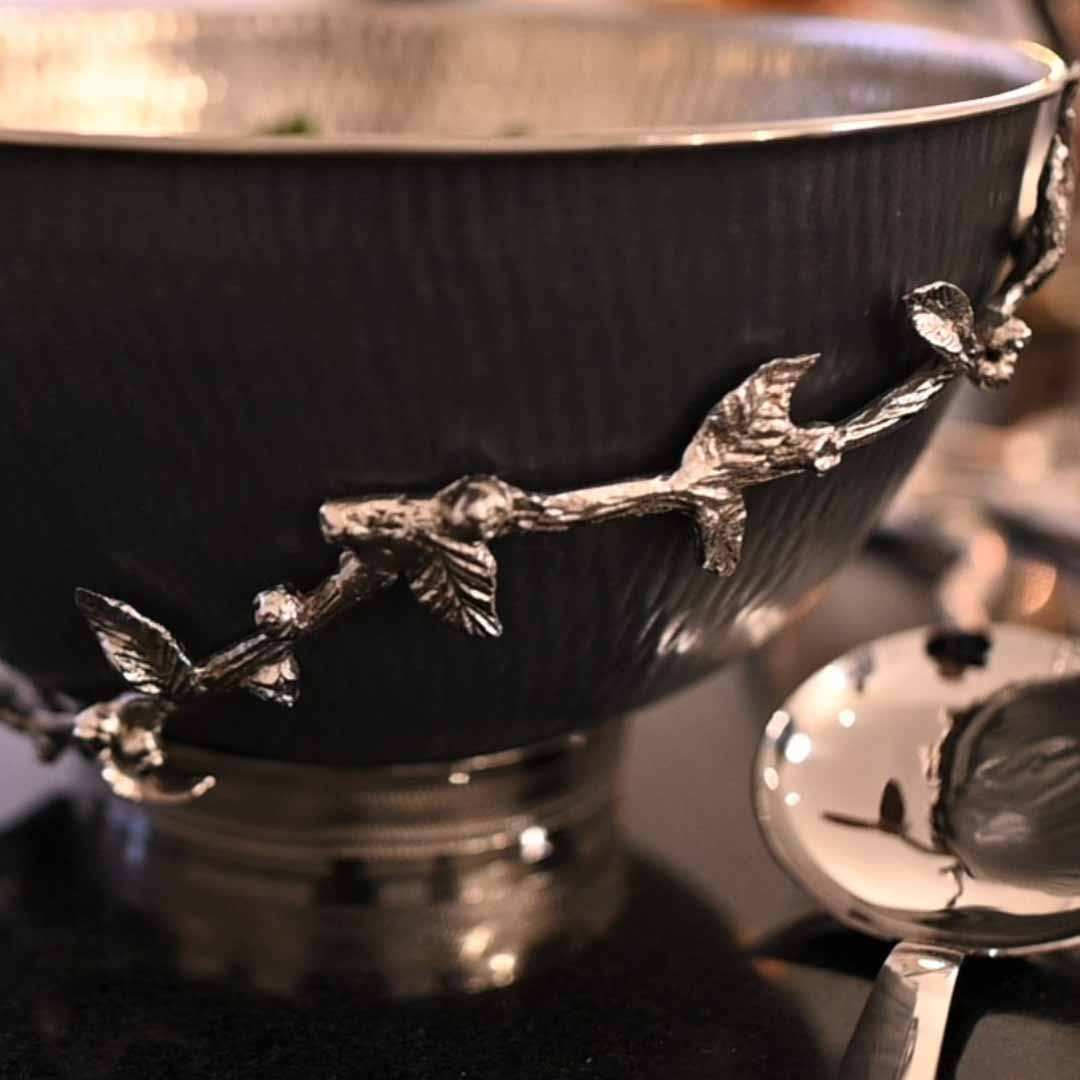
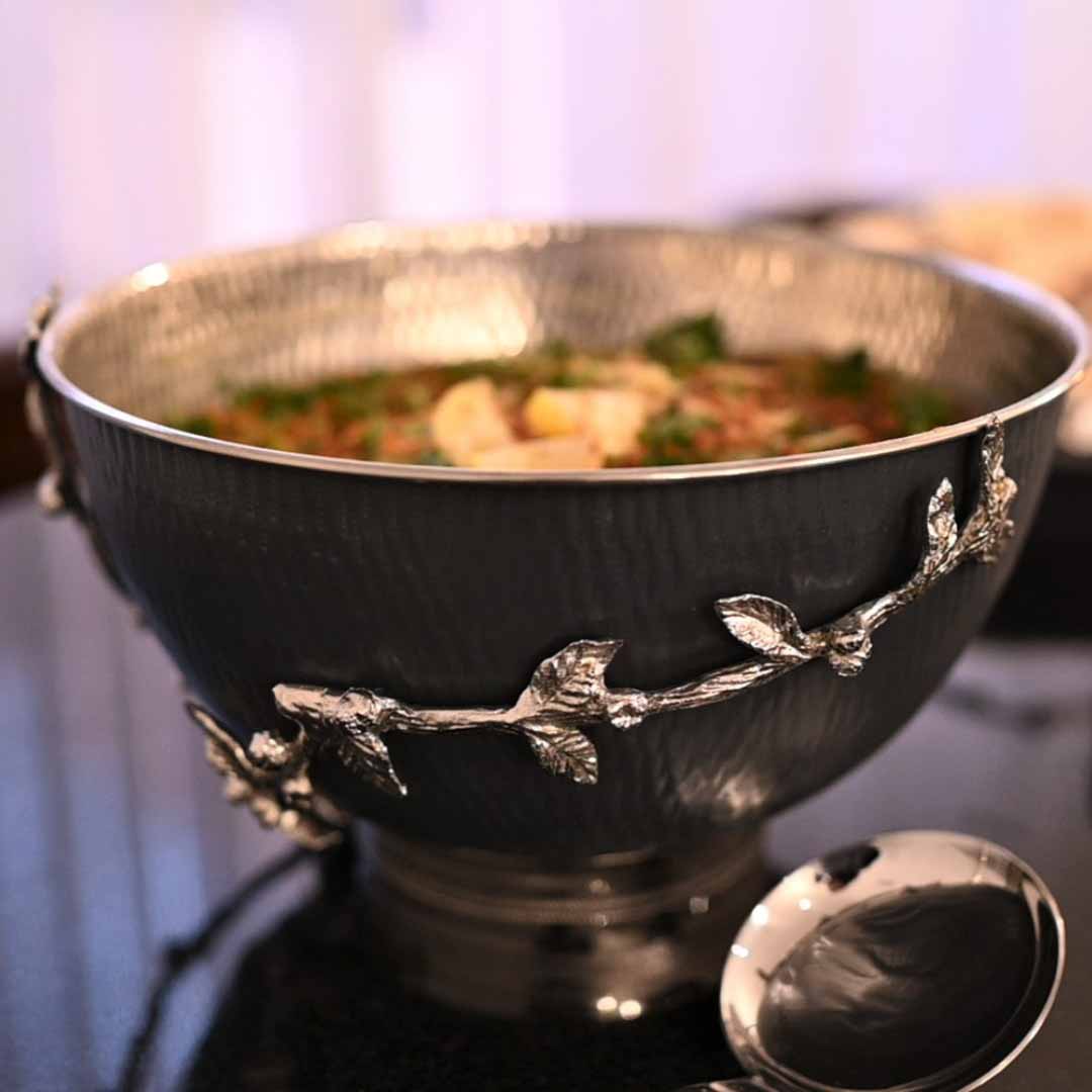
Dining Room. Concentrate contrast into a few pieces, a stone or ceramic centerpiece, brass candle holders, serveware mixing a matte glaze with a polished rim, elegant rather than busy.
Bedroom. Quieter relationships work best: a bedside lamp in soft brass, a small ceramic box, one worn stone object, gentle contrast that supports rest.
Study or Home Office. Texture is the easiest correction for a room that defaults to sterile, leather on a chair, brass on a desk lamp, a lacquered tray beside a rough stone paperweight.
Choose Objects for Their Material Character, Not Just Their Shape
Two objects can share the same silhouette and still carry entirely different weight, because what registers is material quality, the density of a stone base, the patina brass takes on with use, the variation between one ceramic piece and the next from the same hand. That is the distinction between an object that fills space and one that contributes character to it.
This is where well-chosen home decor items earn their place: not as filler, but as small-scale material statements. Interest in home decor Pakistan is shifting toward pieces valued for craftsmanship and material integrity over decoration for its own sake, a marble tray, a hand-finished ceramic bowl, a brass object with real weight. These details are central to how interior design is approached in premium Pakistani homes today.
A well-chosen piece of luxury home decor, or any of the smaller decoration items around it, does not need to announce its value through colour. Its material does the work, the coolness of stone, the glow of metal, the irregularity of handmade ceramic.
Conclusion
Colour may be the first thing a room shows you, but texture is what you remember once you have spent time in it: the coolness of a marble edge, the soft glow of brass in low light, the slight imperfection of a hand-thrown bowl. None of that requires a bold palette or an abundance of objects. It requires materials placed in deliberate relationship to one another, so a room reveals itself slowly rather than all at once. A space does not need more colour or more things in it to feel deep, it needs better relationships between the materials already there.
Fewer objects, better materials, considered finishes, that is the philosophy behind every piece Creo Living puts forward, from serveware and lamps to gifting and furniture. Browse the collection to find pieces chosen for how they feel as much as how they look.
FAQs
1. What does texture-first decorating mean?
It means choosing materials, finishes, and surface qualities before settling on a colour palette or decorative objects. Rather than starting with wall colour, the approach begins with how surfaces feel and reflect light, stone, metal, ceramic, wood, letting those tactile relationships shape the room’s depth and atmosphere from the outset.
2. How can you combine different materials without making a room feel busy?
Limit each grouping to two or three contrasting surfaces, one reflective, one matte, one textured, rather than layering many unrelated finishes together. Repeat materials subtly across a room, leave space around textured objects, and keep the overall colour palette restrained so each surface stays easy to read.
3. Which decorative materials work well in a luxury interior?
Marble, brass, hand-finished ceramic, and lacquer work particularly well because each brings a distinct tactile quality: cool permanence, warm reflectivity, organic irregularity, and controlled sleekness. Combined thoughtfully, decorative items for home in these materials create richness through contrast rather than colour or ornamentation.
4. Can a neutral room still feel interesting without using many colours?
Yes. Neutral rooms rely on surface variation for visual interest, since there is no colour contrast to fall back on. Mixing matte and glossy finishes, warm and cool materials, and smooth and irregular surfaces gives a neutral space real depth, often more effectively than a room built around a bold palette.