





What Is a Vignette?
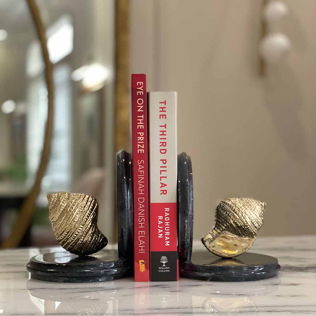
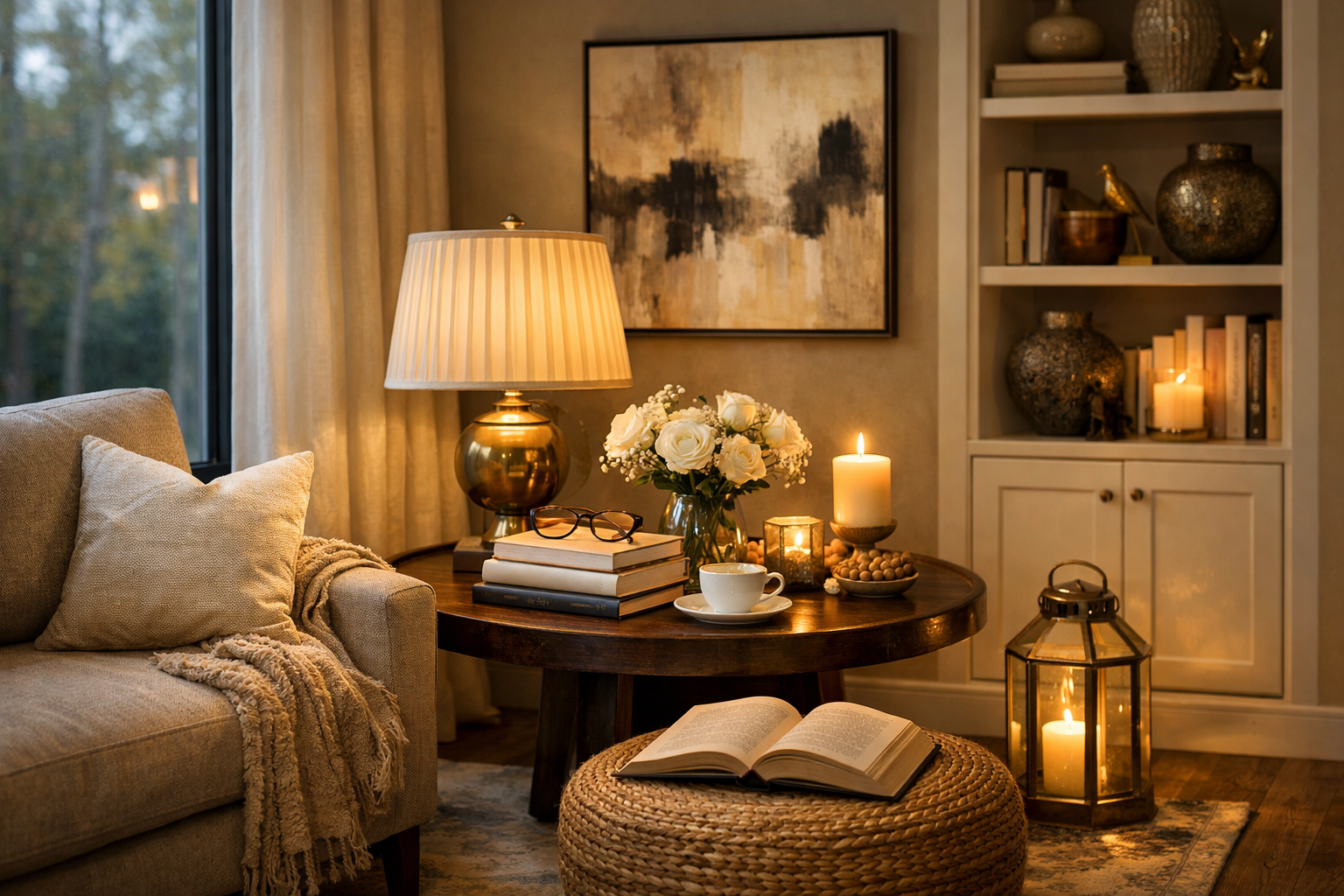
A vignette, in the language of interior design, is a small curated grouping of objects arranged to tell a story within a larger room. Think of it as a paragraph inside a chapter, a console table with a lamp, a stack of books, and a single ceramic bowl, arranged so the eye lingers rather than skims past. Where the rest of a room handles function, the vignette handles feeling.
Professional stylists build entire rooms around these micro-moments. A well-placed vignette on an entryway table or a bedroom windowsill does more to shape how a space is remembered than the sofa or the rug ever will. It’s the detail work, the part of home decor that separates a house that looks put together from one that looks lived-in and loved.
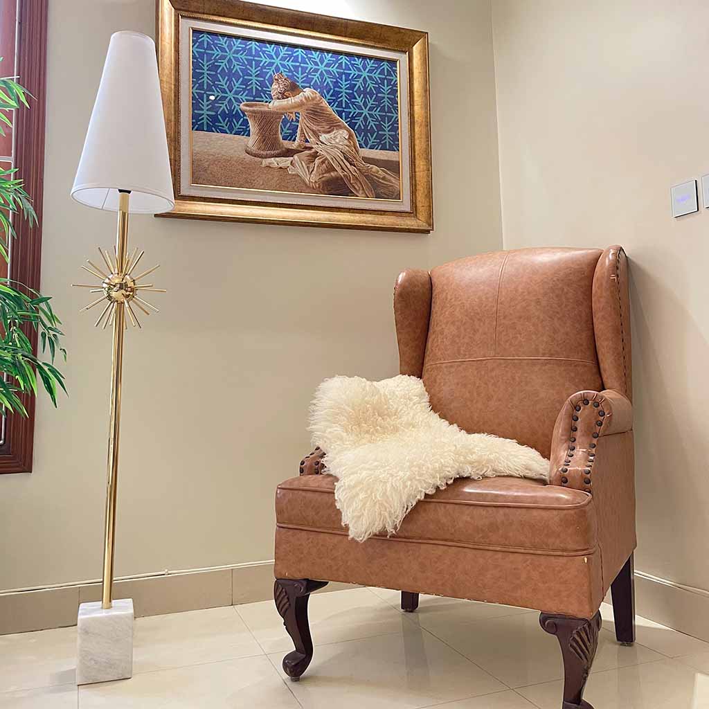
For homeowners across Karachi, Lahore, and Islamabad furnishing homes with marble floors, wooden jaalis, and high ceilings, vignettes matter even more. These architectural features create natural pauses, corners, niches, sills that beg to be filled with intention rather than left blank or cluttered with whatever needs a surface.
The Core Mechanics: The Three-Object Rule and Asymmetrical Balance
Every vignette that photographs well and feels effortless in person is built on a simple structural logic: the rule of three.
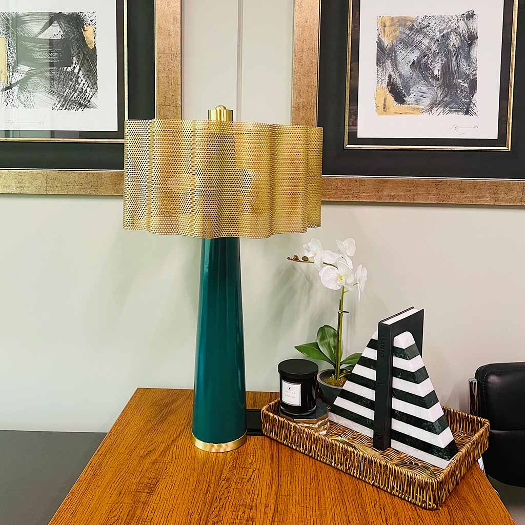
- Something tall, a lamp, a slim vase, or a sculptural candle stand that anchors the vertical line
- Something broad, a stack of books, a low tray, or a wide ceramic bowl that grounds the base
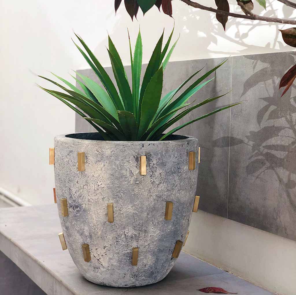
- Something organic, a small bowl of dried florals, a piece of raw stone, or a hand-thrown vessel that softens the geometry
The magic isn’t in the objects themselves but in how they’re weighted against each other. Rigid symmetry, two identical lamps, two matching candles, reads as decoration for decoration’s sake. Asymmetrical balance, where a tall object sits slightly off-center and is offset by a lower, wider one, mimics how the eye naturally studies a landscape: it holds interest because nothing is fully predictable.
A useful habit is triangulating heights. If you sketch a line connecting the top of each object in a grouping, it should form an uneven triangle, not a straight row. This single adjustment is often the difference between a vignette that feels curated and one that feels accidental.
Surface by Surface: Customizing Vignettes for Every Nook
Not every surface asks for the same treatment. The best interior styling adapts the rule of three to the architecture of the space itself.
Console Tables: Console tables anchor large stretches of wall, so they need a taller visual anchor, a mirror or a framed piece of art, layered behind the tabletop grouping. Place a lamp toward one end, a stack of books at the center, and a smaller sculptural piece at the opposite end to keep the eye moving across the full width.
Open Shelves: Shelving rewards restraint. Alternate heights across tiers rather than filling every shelf evenly, and leave visible negative space between groupings; roughly a third of each shelf should stay empty. This is where a rotating edit of decoration items works particularly well, since shelves are easy to refresh seasonally.
Windowsills: Natural light is the real material here. Translucent glass, brushed metal, and pale ceramic decorative items for home catch and scatter daylight rather than blocking it, so keep windowsill vignettes low-profile and reflective rather than heavy or opaque.
Niche Alcoves: Built-in niches are a gift, they come with their own frame. A single dramatic object, lit softly from above or within the recess, will always outperform a cluttered grouping in this context. Let the architecture do most of the work.
The Light Factor: Adding Dimensionality with Shadows and Glow
A vignette without light is a flat photograph of itself. Sunlight moving across a room during the day changes how a grouping reads hour to hour, which is why professional stylists test arrangements at different times before finalizing them.
Ambient artificial light, a table lamp with a warm bulb, a wall sconce angled toward a shelf, does the same work after dark. It isn’t just illumination; it’s sculpting. Light falling across a brass tray or a polished stone bowl throws soft shadows that give even a two-inch-deep grouping real dimensionality.
Reflective materials are worth prioritizing for this reason alone. Brass, ceramic glaze, and honed marble catch and bounce light in a way that matte, flat-finish objects simply can’t, turning a static arrangement into something that shifts throughout the day.
Quick Fixes: Correcting Vignette Mistakes Without Starting Over
Most vignettes don’t need a teardown, they need small corrections.
- Matching heights: If everything sits at the same level, swap one object for a taller or shorter alternative, or elevate it on a small stack of books.
- Overcrowded surfaces: Remove one object entirely before adding anything new. Most groupings improve the moment something is taken away.
- Floating objects: An item with nothing beneath or behind it looks accidental. Anchor it with a tray, a book, or a textured mat.
- No focal point: If your eye doesn’t land anywhere specific, your tallest object likely needs to move off-center.
These are the same troubleshooting habits used across professional home decor Pakistan projects, where budgets and timelines rarely allow for a full restyle, only refinement.
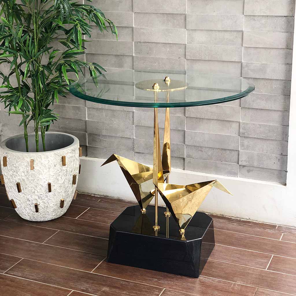
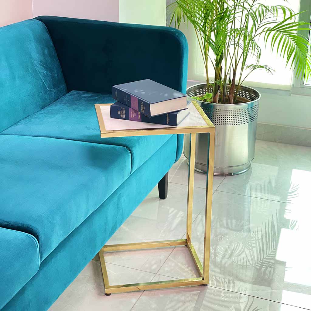
Creo Living’s collection of premium gifting pieces, lamps, serveware, and home decor items gives every vignette its finishing layer. Bring that same considered elegance home, because the right decorative items for home turn empty corners into the parts of a house guests remember.
FAQs
Q: How many objects should be in a single vignette?
A: Three is the reliable baseline, though five works if grouped in odd-numbered clusters of three and two. Even numbers tend to feel static.
Q: Can I mix different materials within one vignette?
A: Yes, mixing wood, brass, ceramic, and stone within a single grouping is what gives it depth. Repeating one material across every object flattens the composition.
Q: What’s the biggest mistake people make with home decor items on a console table?
A: Centering everything in a single straight line. Off-center groupings with layered depth almost always look more considered.
Q: How often should I refresh a vignette?
A: Seasonally is a good rhythm, swapping one or two pieces rather than the whole arrangement keeps a space feeling current without losing its foundation.