The Reverse Palette Strategy
Most homeowners begin a room the wrong way round. They choose a wall colour first, then spend months chasing accessories that never quite agree with it. Ask any seasoned interior designer, and you will hear the same quiet confession: the paint should almost always come last, not first.
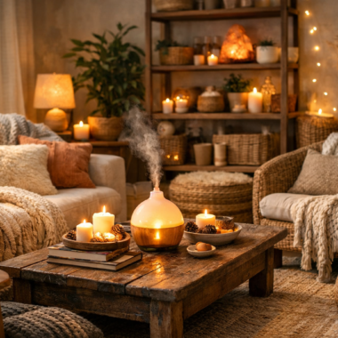
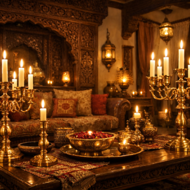
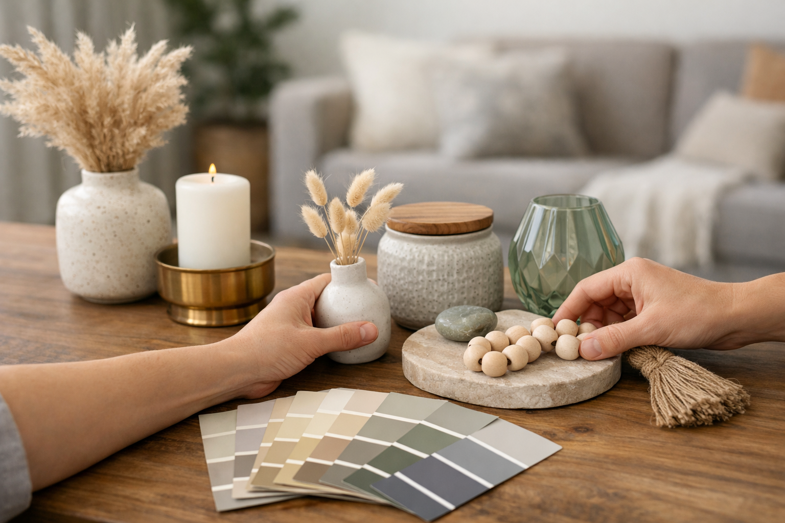
This is the reverse palette strategy. Instead of committing to four walls of colour before you’ve lived with a single object in the room, you start with what’s moveable, a brass tray, a ceramic vase, a set of candle stands, and let those pieces dictate the emotional register of the space. Small, high-quality accents carry disproportionate visual weight. A single well-chosen object can anchor an entire colour story more convincingly than a gallon of paint ever could, and if the palette doesn’t work, you’re repainting a tray, not a wall.
Decoding Material Undertones: Brass, Marble, and Ceramic
Every material carries a hidden temperature, and learning to read it is the single most useful skill in curating home decor items that actually belong together.
Warm Undertones
- Polished brass, with its honeyed, golden glow
- Raw terracotta, earthy and sun-baked
- Travertine with warm beige veining
- Ceramics glazed in ochre, rust, or cream
Cool Undertones
- White Carrara marble, with its blue-grey veining
- Slate stone and charcoal finishes
- Chrome and brushed steel
- Matte black metalwork
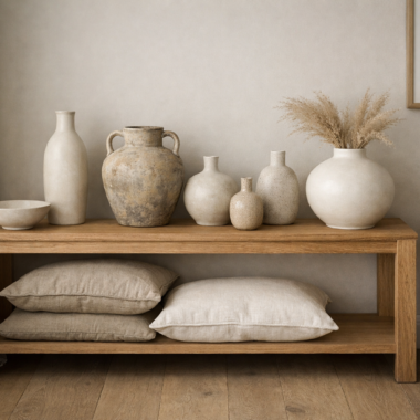
The trick isn’t picking a side permanently, it’s noticing where undertones overlap. A cream ceramic vase can bridge into a cooler scheme if its base tone leans grey rather than yellow. Hold two pieces together in daylight, not under a warm bulb, before deciding whether they truly belong in the same room.
Temperature Control: Warm Heritage vs. Cool Contemporary Palettes
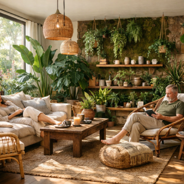
A warm, heritage-leaning palette suits homes with heavy woodwork, jharoka-inspired window frames, or traditional Mughal-influenced detailing, think brass, amber glass, and richly glazed terracotta. A cool, contemporary palette suits minimalist, light-filled interiors: marble, smoked glass, matte black.
Pakistani homes present a particular lighting challenge: intense, direct sun for much of the year, often filtered through large window profiles that flood rooms with harsh light by midday. Warm finishes like brushed brass soften and diffuse that light beautifully, while cool finishes like chrome can look almost clinical under strong afternoon glare. Match your accessory temperature not just to your furniture, but to the specific quality of light your room receives at different hours.
The Color Bridge & The Neutral Anchor Rule
The Color Bridge: When two elements in a room genuinely clash, a bold emerald sofa against terracotta-toned walls, for instance, a well-chosen decorative object can reconcile them. A deep green ceramic bowl with a rust-flecked glaze pulls both colours into conversation, giving the eye a resting point that references each side without fully committing to either.
The Neutral Anchor Rule: Every strong palette needs one dominant, grounding neutral running through its accessories: cream, warm grey, or taupe. This is what prevents a curated room from tipping into visual clutter. If your candle stands are brass, your trays are cream ceramic, and your cushions are taupe linen, the neutral thread lets bolder accent colours rotate freely with the seasons without the room ever feeling disjointed.
Room-by-Room Guide for Pakistani Interiors
Regional architecture, marble or tile flooring, ornate woodwork, and generous window bays calls for a deliberate approach to interior design at every threshold of the home.
Entryway / Foyer: This is where the colour narrative begins. A console styled with two or three decoration items in your anchor neutral, plus one accent piece in your chosen temperature, sets expectations for everything beyond it.
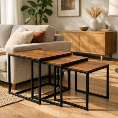
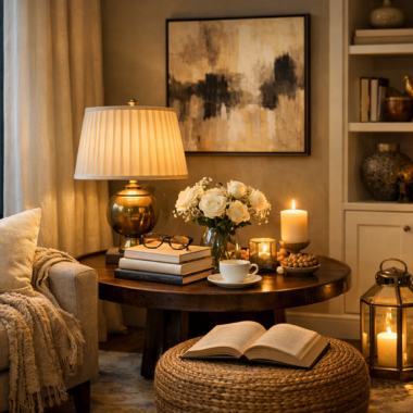
Drawing Room / Living Area: Coffee table styling should echo, not compete with, your seating. Layer a tray, a stack of books, and one sculptural object, each drawing from the same undertone family as your upholstery.
Dining Room: Serveware, candle holders, and table runners are where seasonal colour experimentation belongs. Keep the base neutral and consistent and let one accent, a runner, a set of napkin rings, carry the seasonal statement.
Master Bedroom: Nightstands and dressers should transition gently rather than shout. Soft ceramic pieces, a single brass or matte-black accent, and restrained texture create the restful quality this room demands.
Thoughtfully chosen decorative items for home spaces don’t just fill surfaces, they tell you, room by room, exactly where the eye should land first.
Your home’s colour story deserves objects with the same intention behind them. Creo Living’s curated collection of gifting pieces, furniture, lamps, and serveware gives every room the anchor it’s been missing.
FAQs
Q1: Where should I start if I’m building a colour palette from scratch?
A: Start with one accessory you already love, a vase, a tray, a set of candle stands, and build outward from its undertone rather than starting with paint.
Q2: How many colours should a well-curated room actually have?
A: Aim for one dominant neutral, one warm or cool accent family, and no more than one bold statement colour rotating seasonally.
Q3: Can warm and cool finishes ever coexist in the same room?
A: Yes, through a colour bridge object that shares undertones with both, a mixed-metal piece or a glaze that leans neither fully warm nor fully cool.
Q4: What’s the biggest mistake people make when shopping for home decor Pakistan-wide?
A: Buying accessories individually without checking undertones against pieces already in the room, resulting in a collection of beautiful objects that don’t speak to one another.